Been on a bit of a nostalgia trip recently -- no connection to turning 42, I'm sure -- and I noticed all these album covers from 90s alternative bands that are in black and white, and usually with something on fire.
Don't believe me? Ok, here's exhibit A:

Better Than Extra's Friction, Baby. Released 1996. No fire here, but it's a grayscale image, and the fire is implied, no? That torn piece of paper, plus the album's title, captures the moment just before the match is lit.
Here's another one, where the fire moves from implicit to explicit:
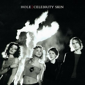
Hole, Celebrity Skin, released 1998. Sharper tones in this one, more contrast. Shot of the band in the foreground, looking nonchalant as a tree burns in the background. Did they set it aflame with the power of their rock? Was their cool just too much for the tree to take? We'll never know.
The trend wasn't just for American bands, oh no. Here's German band Fury in the Slaughterhouse's cover for their 1992 album, Mono:
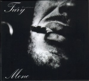
Super-extreme stubble close-up. The face is weary, resigned. Shot is overall very dark. Meant to evoke the ennui in the album's hit single, "Every Generation Got Its Own Disease"?
Content Warning for the next two: Self-Harm, Nudity.
I'd be remiss not to mention the cover of one of the greatest albums of the 90s, released by one of my favorite bands:

Rage Against the Machine, self-titled album, 1992. If you don't know the history behind that photo, well...here's the wikipedia link. Suffice to say that it perfectly fits the album's themes of resistance to (racist, capitalist) authority.
But how far back does the trend go? One of the earliest examples I can find is from 1988, with Jane's Addiction's Nothing's Shocking:
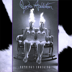
Notice all the elements are already there: the fire, the black and white retro chic, the nonchalance on the human faces. Ahead of their time in more ways than musically?